
Project Shiny ☆ Design System ☆ Colours
A system so that I can create software that looks good and is on brand with minimal cognitive disruption.
To maintain consistency across the various aspects of Project Shiny, I plan to implement a design system—a collection of reusable components, guidelines, and assets designed to streamline design and development.
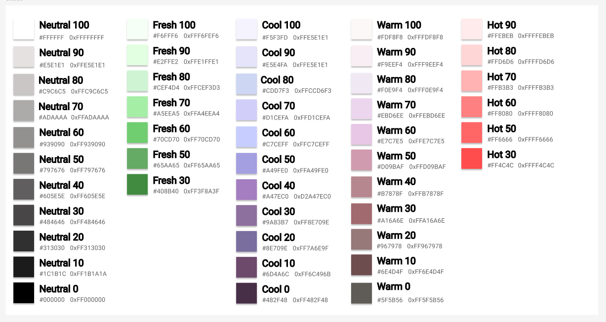
The first step is to establish a cohesive color palette. I’ve decided to organize the palette into five categories, each scaled by lightness to ensure a consistent appearance across all categories. Limiting the palette to five categories simplifies design decisions and ensures ease of use. The five categories I chose seemed to cover the gamet of what I will need, group the colours logically and allow for quick decision making.
In the web app I have the colours defined in the tailwind config:
/** @type {import('tailwindcss').Config} */
export default {
  content: ['./src/**/*.{astro,html,js,jsx,md,mdx,svelte,ts,tsx,vue}'],
  theme: {
    colors: {
      transparent: 'transparent',
      current: 'currentColor',

      'neutral-100': '#FFFFFF',
      'neutral-90': '#E5E1E1',
      'neutral-80': '#C9C6C5',
      'neutral-70': '#ADAAAA',
      'neutral-60': '#939090',
      'neutral-50': '#797676',
      'neutral-40': '#605E5E',
      'neutral-30': '#484646',
      'neutral-20': '#313030',
      'neutral-10': '#1C1B1C',
      'neutral-0': '#000000',

      ...
    },
  },
}
and in the mobile app, the colours are also defined in code:
class NeutralColors {
  static const neutral100 = Color(0xFFFFFFFF);
  static const neutral90 = Color(0xFFE5E1E1);
  static const neutral80 = Color(0xFFC9C6C5);
  static const neutral70 = Color(0xFFADAAAA);
  ...
}

class CoolColors {
  static const Color cool100 = Color(0xFFF5F3FD);
  static const Color cool90 = Color(0xFFE5E4FA);
  static const Color cool80 = Color(0xFFCCD6F3);
  static const Color cool70 = Color(0xFFD1CEFA);
  ...
}

...

class NamedColors {
  static const Color black = NeutralColors.neutral0;
  static const Color white = NeutralColors.neutral100;
  static const Color lightBlue = CoolColors.cool80;
  ...
}
In the theme of the mobile app I assigned the named colours to the roles in the material design color scheme:
ColorScheme _colorSchemeLight = const ColorScheme.light(
  primary: CoolColors.cool20,
  surfaceTint: WarmColors.warm40,
  onPrimary: NeutralColors.neutral100,
  primaryContainer: CoolColors.cool100,
  primaryContainer: CoolColors.cool100,
  onPrimaryContainer: NeutralColors.neutral0,
  secondary: WarmColors.warm50,
  onSecondary: NeutralColors.neutral100,
  secondaryContainer: CoolColors.cool70,
  onSecondaryContainer: NeutralColors.neutral40,
  ...
);
and the same with dark mode:
ColorScheme _colorSchemeDark = const ColorScheme.dark(
  primary: CoolColors.cool20,
  surfaceTint: WarmColors.warm40,
  onPrimary: NeutralColors.neutral100,
  primaryContainer: WarmColors.warm70,
  onPrimaryContainer: NeutralColors.neutral0,
  secondary: WarmColors.warm50,
  onSecondary: NeutralColors.neutral100,
  secondaryContainer: CoolColors.cool80,
  onSecondaryContainer: NeutralColors.neutral10,
  ...
);
Creating this system of colours means that I can quickly and easily make good design decisions around colour as Shiny comes together. This allows me to focus on what I am working on and maintain flow.